UX Design - Mobile App
Dermly - Skincare Discovery for Sensitive Skin
A concept mobile app that helps people with reactive and sensitive skin find products they can actually trust without needing a dermatology degree to decode ingredient lists.
Year :
2026
Industry :
Heath & Beauty
Client :
Concept Project
Project Duration :
8 weeks
Introduction:
This project started from a fairly personal frustration. A close friend of mine has rosacea and was trying to find a new moisturizer. She spent almost an hour on Sephora's app one afternoon, scrolling, reading reviews, Googling ingredient names, cross-referencing Reddit threads and still walked away with nothing. Not because there weren't good products. There were hundreds. The problem was she had no way to know which ones were safe for her specifically.
That became the question I wanted to answer: How might we help people with sensitive skin find products they can trust, without making them become skincare experts first?
Dermly is a concept mobile app I designed over 8 weeks that flips the typical skincare shopping model. Instead of browse -> filter -> hopefully find something safe, it's build a profile -> see only what's safe -> shop with confidence. The key feature is a "Skin Match Score" - a personalized compatibility rating on every product based on your specific sensitivities, skin type, and flagged ingredients.
Challenge:
Skincare shopping is uniquely hard for people with sensitive skin for a few reasons:
Ingredient lists are long (40+ items) and written in Latin/chemical names that mean nothing to most people
Reviews aren't filtered by skin type, so a 5-star review from someone with normal skin tells you nothing useful if you have eczema
Unlike clothes, you can't "try and return" skincare - a bad reaction takes days to show up, and by then the return window is closed
Apps like INCI Beauty do ingredient analysis well but they're clinical tools, not shopping experiences
Process Overview
Process Overview
01.
Secondary Research
Secondary Research
Reddit communities, app store reviews, competitor audit.
02.
User Interviews
User Interviews
8 sessions with sensitive-skin users to uncover trust patterns.
03.
Persona + Journey
Persona + Journey
1 focused primary persona, emotional journey mapping.
04.
Wireframes
Wireframes
3 layout iterations on the Product Detail screen to nail the score.
05.
Hi-Fi + Testing
Hi-Fi + Testing
Style guide, design system, and threshold labeling system.
detailed PROCESS:
RESEARCH & DISCOVERY:
I started with secondary research, reading through skincare communities on Reddit (r/SkincareAddiction and r/SensitiveSkinCommunity have a combined ~3M members), looking at app store reviews for existing skincare apps and doing a competitor audit of 4 products: the Sephora app, Amazon, INCI Beauty and Think Dirty.
I also did 8 informal interviews with friends and classmates who identified as having some form of skin sensitivity (sensitive, eczema-prone, rosacea, or acne-prone). These weren't formal usability sessions, more like conversations over coffee where I asked them to walk me through their last skincare purchase. The patterns were pretty consistent.

For a closer look, check it out in Figma » https://www.figma.com/design/rg0ZkMAt2WnA0ogTtCvfkM/Dermly---UX-Case-Study?node-id=1-2&p=f&t=LoJUZhBwXpy1CFXZ-0
What the Interviews Revealed:
A few things kept coming up across almost every conversation I had:
"I've tried so many things that broke me out. At this point I just buy the same 3 products on repeat even though I want to try other stuff." - Interview participant, 24, eczema-prone skin
"Reviews help but you never know if that person has similar skin to you. A review from someone with oily skin doesn't mean anything to me." - Interview participant, 31, rosacea
People weren't lazy, they were burned. Multiple bad experiences had made them risk-averse and suspicious of new products. The design problem wasn't really about discovery. It was about trust.
user Persona:
I focused on one primary persona since a product with this level of personalization should probably start narrow. I can see the persona expanding with more research, but for this project I wanted to design specifically for one person and do it well.
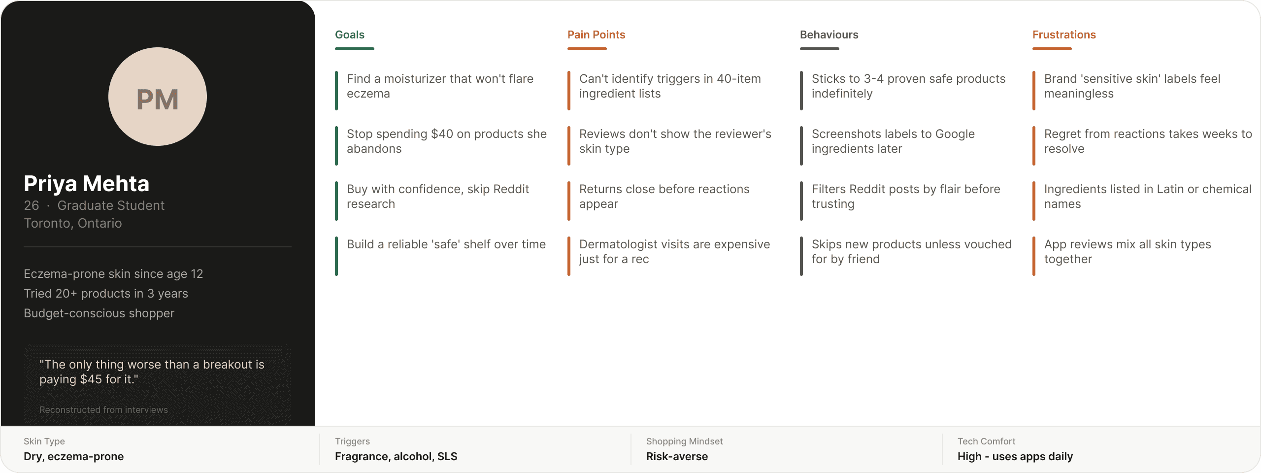
For a closer look, check it out in Figma » https://www.figma.com/design/rg0ZkMAt2WnA0ogTtCvfkM/Dermly---UX-Case-Study?node-id=1-3&p=f&t=LoJUZhBwXpy1CFXZ-0
Customer Journey Map:
Building low fi/mid-fi prototypes allowed us to validate structure and flows before adding visual style.
Feedback-driven improvements included:
Switching from vertical to horizontal scroll for categories to reduce clutter.
Adding a search bar for easier menu browsing.
Displaying prices consistently throughout checkout for transparency.
For a closer look, check it out in Figma » https://www.figma.com/design/rg0ZkMAt2WnA0ogTtCvfkM/Dermly---UX-Case-Study?node-id=180-310&t=LoJUZhBwXpy1CFXZ-0
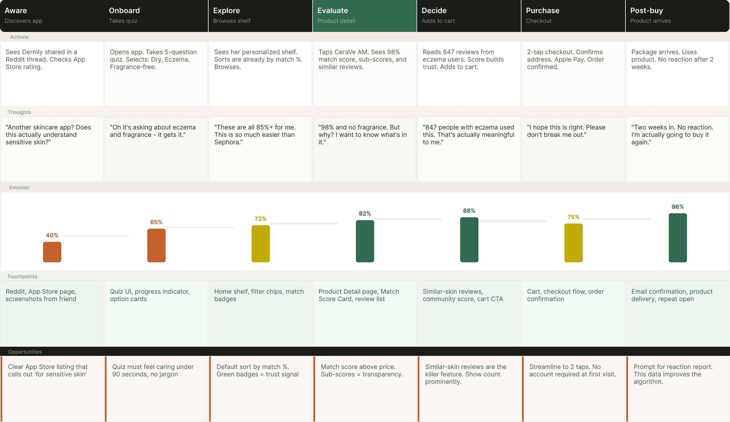
User Flow:
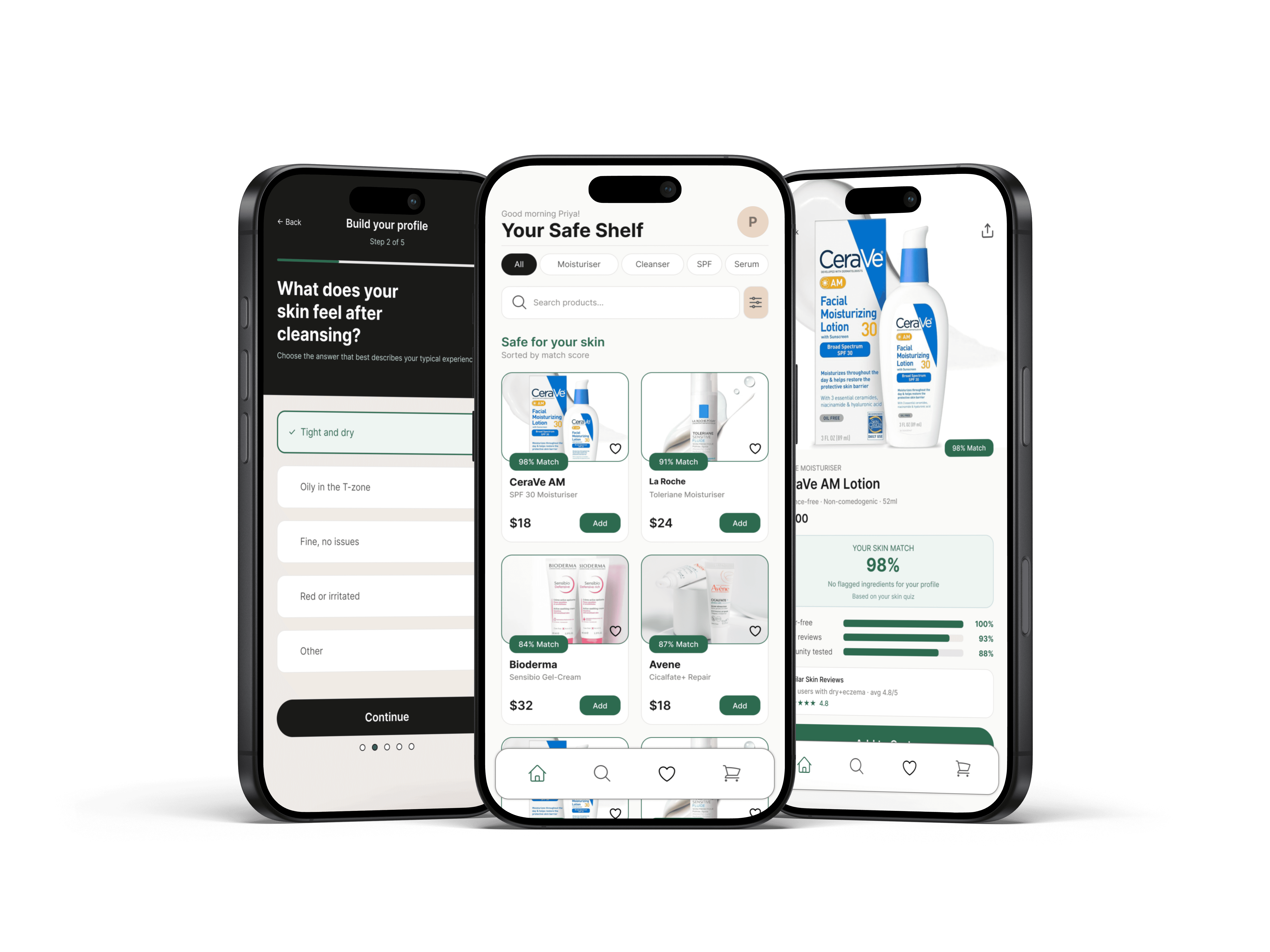
Before jumping into wireframes, I mapped out the core journey. The key design decision here was front-loading the skin profile unlike competitors where you browse first and filter later, Dermly asks for your profile upfront. This felt like a risk (adding friction at entry) but the interviews suggested users with sensitive skin actually want to be asked. It signals the app understands their situation.
The highlighted step - Product Detail, is where the most design work happened. Getting the Skin Match Score right here was the whole point of the app. If that screen didn't work, nothing else mattered.
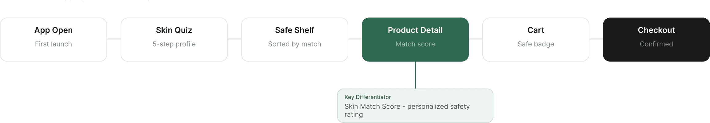
For a closer look, check it out in Figma » https://www.figma.com/design/rg0ZkMAt2WnA0ogTtCvfkM/Dermly---UX-Case-Study?node-id=1-5&p=f&t=LoJUZhBwXpy1CFXZ-0
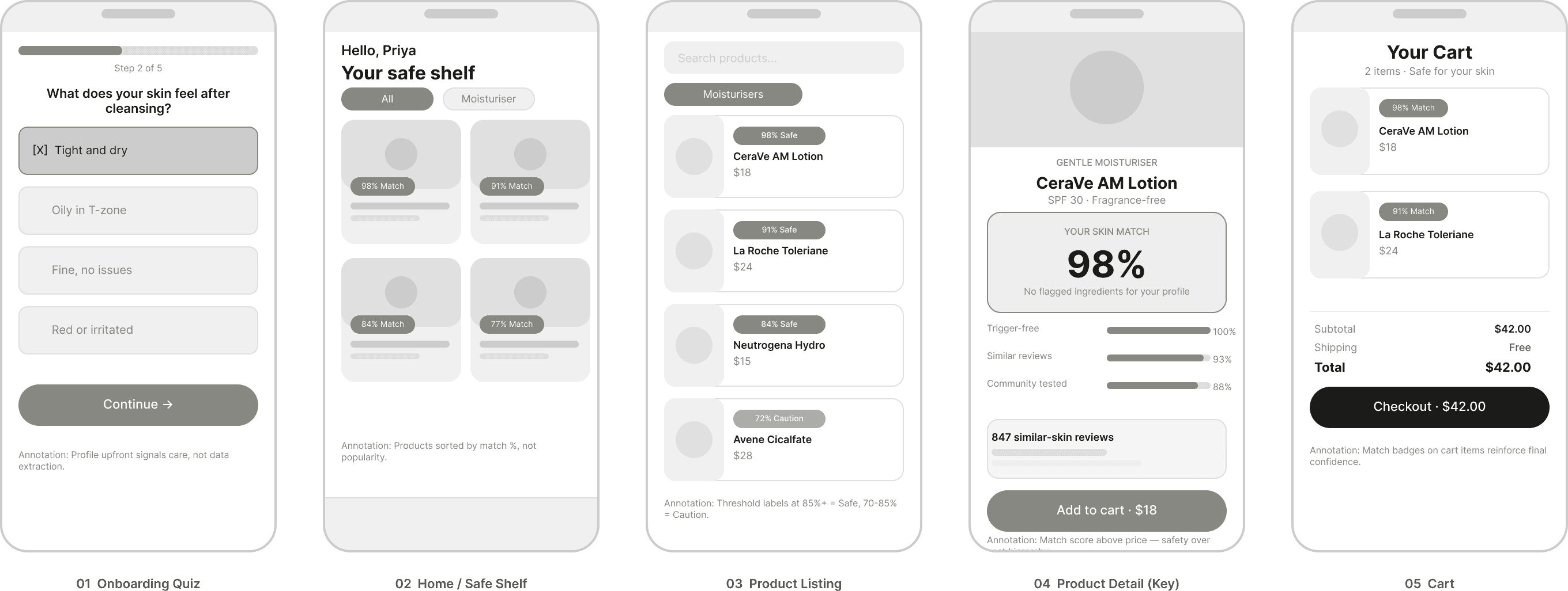
Sketches & Lo-Fi Wireframes:
I sketched out all 5 key screens first (paper sketches, not shown here since they're genuinely illegible). Then moved into lo-fi in Figma. The goal at this stage was just to get the structure right not visuals. I wanted to make sure the Skin Match Score concept was readable before I started designing around it.
The most challenging wireframe was the Product Detail page. I went through 3 different layouts for how to show the match breakdown before landing on the accordion-style breakdown (score -> three sub-scores -> expandable ingredient list). The first two felt either too buried or too noisy.
One thing I kept coming back to in the wireframe stage: the match score had to feel like it was for you, not just a generic rating. An 87% score needed to be legible as "this is 87% safe for Priya's skin", not "87 people out of 100 like this product." The breakdown into three sub-scores (trigger-free, similar reviews, community tested) was my answer to that.
For a closer look, check it out in Figma » https://www.figma.com/design/rg0ZkMAt2WnA0ogTtCvfkM/Dermly---UX-Case-Study?node-id=180-311&p=f&t=LoJUZhBwXpy1CFXZ-0
Style Guide & Design System:
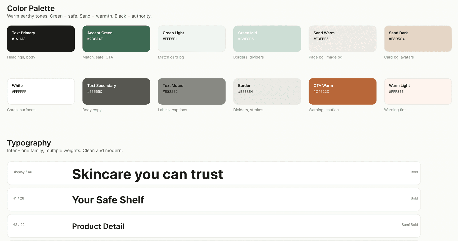
The visual direction was driven by one idea: skincare products for sensitive skin should feel safe, not clinical. Most skincare apps lean either medical-clean (white + blue, antiseptic) or luxury-aspirational (black + gold). I wanted something warmer - earthy, grounded, honest.
The green accent was a deliberate semantic choice, every element related to safety and compatibility uses this color. Match scores, safe product badges, the "Add to cart" button. It creates an unconscious association: green = this is okay for you. It's a small detail but I think it matters for a product built around trust.
For a closer look, check it out in Figma » https://www.figma.com/design/rg0ZkMAt2WnA0ogTtCvfkM/Dermly---UX-Case-Study?node-id=1-6&p=f&t=LoJUZhBwXpy1CFXZ-0
High-Fidelity Screens:
The hi-fi phase was where the whole thing came together or didn't, depending on the screen. The onboarding quiz and product detail were the strongest screens. The product listing page went through more iterations than I expected because sorting by "match percentage" created a weird hierarchy that made lower-matched products feel like they were "unsafe" even if they had a 78% match.
I ended up adding a threshold label: products above 85% show as "Safe for you", 70-85% as "Use with caution", below 70% are hidden by default (but can be shown). This felt more honest than just a number.

For a closer look, check it out in Figma » https://www.figma.com/design/vGorZz2ovREElO4DBw8OCy/Old-Country-Inn-Redesign?node-id=2011-1684
The Decision Support Feature: Skin Match Score
The Skin Match Score is the core feature that differentiates Dermly. It's a personalized compatibility score on every product, calculated from three things:
Trigger-free: Does the product contain any ingredients flagged in your skin profile? (Fragrance, alcohol, certain acids, etc.) This is binary, either it's clean or it flags specific ingredients.
Similar-skin reviews: What's the average rating from users with skin profiles similar to yours? Filters out reviews from people with fundamentally different skin types.
Community tested: How many users with similar profiles have used this product without reporting a reaction? This builds over time with the user base.
The score sits at the top of the product detail page, above the price, above the description. This was a deliberate hierarchy decision. For this user, "is it safe for me?" is more important than "how much does it cost?" and that should be reflected in the layout.
Usability Testing:
I ran 5 moderated usability sessions with participants who have some form of skin sensitivity. Sessions were 30 minutes each, using a Figma prototype. I gave participants a task: "You're looking for a new daily moisturizer. Find one you'd feel comfortable buying."
Key findings:
Match score concept landed immediately - 4 out of 5 participants understood what the score meant without me explaining it. The one who didn't was confused about whether 98% meant "98% of people like it" or "98% safe for you." That's a copy problem, not a concept problem. I added the sub-label "safe for your skin profile" after testing.
"Similar skin reviews" was the most trusted element - Multiple participants said this was the thing that would actually change their buying behaviour. One said: "This is the one thing I've always wanted and never had."
The quiz felt thorough but not annoying - All 5 participants completed the 5-step quiz without dropping off. Average time: about 90 seconds. Two said it felt "reassuring" that the app was asking these questions.
One participant wanted to add products they already use - The idea being that if the app could verify their existing safe products matched the algorithm, they'd trust it more for new recommendations. This is a good V2 feature I didn't have time to explore.
The main usability issue I didn't fully resolve: the product listing page felt less trustworthy to one participant because they couldn't see why a product had a certain match score before tapping in. Adding a small preview of the top match reason on the listing card (e.g., "No fragrance, 847 similar reviews") would help.
Conclusion:
This project made me think hard about trust as a design problem. In most e-commerce, trust is table stakes, you trust that the product looks like the photo and ships on time. In skincare for sensitive skin, trust has a completely different dimension: will this hurt me?
The Skin Match Score and similar-skin reviews were my answers to that, and based on the testing, they worked at least conceptually. The harder, unresolved challenge is that these features depend on a critical mass of user data that a new app wouldn't have on day one. A 98% score based on 6 similar reviews is very different from a 98% score based on 600. I built the UX for the latter state without fully solving the former.
That's a product strategy problem as much as a UX one. The honest answer is I'd need a partnerships strategy (pharmacies, dermatologist networks, brand data) to bootstrap the database before the experience works as designed.
What I’d Do Differently:
Run the quiz with more diverse participants, I may have built for eczema/rosacea and missed other profiles that don't map neatly to those categories
Design a proper empty state for new users where similar-skin reviews don't exist yet, right now the experience falls apart in that scenario
Explore whether a dermatologist-verified badge on certain products increases trust or just adds noise. I suspect it helps, but I didn't test it.
Consider a "report a reaction" feature - it would improve data quality and make users feel like contributors rather than just consumers of the algorithm
UX Design - Mobile App
Dermly - Skincare Discovery for Sensitive Skin
A concept mobile app that helps people with reactive and sensitive skin find products they can actually trust without needing a dermatology degree to decode ingredient lists.
Year :
2026
Industry :
Heath & Beauty
Client :
Concept Project
Project Duration :
8 weeks
Introduction:
This project started from a fairly personal frustration. A close friend of mine has rosacea and was trying to find a new moisturizer. She spent almost an hour on Sephora's app one afternoon, scrolling, reading reviews, Googling ingredient names, cross-referencing Reddit threads and still walked away with nothing. Not because there weren't good products. There were hundreds. The problem was she had no way to know which ones were safe for her specifically.
That became the question I wanted to answer: How might we help people with sensitive skin find products they can trust, without making them become skincare experts first?
Dermly is a concept mobile app I designed over 8 weeks that flips the typical skincare shopping model. Instead of browse -> filter -> hopefully find something safe, it's build a profile -> see only what's safe -> shop with confidence. The key feature is a "Skin Match Score" - a personalized compatibility rating on every product based on your specific sensitivities, skin type, and flagged ingredients.
Challenge:
Skincare shopping is uniquely hard for people with sensitive skin for a few reasons:
Ingredient lists are long (40+ items) and written in Latin/chemical names that mean nothing to most people
Reviews aren't filtered by skin type, so a 5-star review from someone with normal skin tells you nothing useful if you have eczema
Unlike clothes, you can't "try and return" skincare - a bad reaction takes days to show up, and by then the return window is closed
Apps like INCI Beauty do ingredient analysis well but they're clinical tools, not shopping experiences
Process Overview
Process Overview
01.
Secondary Research
Secondary Research
Reddit communities, app store reviews, competitor audit.
02.
User Interviews
User Interviews
8 sessions with sensitive-skin users to uncover trust patterns.
03.
Persona + Journey
Persona + Journey
1 focused primary persona, emotional journey mapping.
04.
Wireframes
Wireframes
3 layout iterations on the Product Detail screen to nail the score.
05.
Hi-Fi + Testing
Hi-Fi + Testing
Style guide, design system, and threshold labeling system.
detailed PROCESS:
RESEARCH & DISCOVERY:
I started with secondary research, reading through skincare communities on Reddit (r/SkincareAddiction and r/SensitiveSkinCommunity have a combined ~3M members), looking at app store reviews for existing skincare apps and doing a competitor audit of 4 products: the Sephora app, Amazon, INCI Beauty and Think Dirty.
I also did 8 informal interviews with friends and classmates who identified as having some form of skin sensitivity (sensitive, eczema-prone, rosacea, or acne-prone). These weren't formal usability sessions, more like conversations over coffee where I asked them to walk me through their last skincare purchase. The patterns were pretty consistent.
For a closer look, check it out in Figma » https://www.figma.com/design/rg0ZkMAt2WnA0ogTtCvfkM/Dermly---UX-Case-Study?node-id=1-2&p=f&t=LoJUZhBwXpy1CFXZ-0
What the Interviews Revealed:
A few things kept coming up across almost every conversation I had:
"I've tried so many things that broke me out. At this point I just buy the same 3 products on repeat even though I want to try other stuff." - Interview participant, 24, eczema-prone skin
"Reviews help but you never know if that person has similar skin to you. A review from someone with oily skin doesn't mean anything to me." - Interview participant, 31, rosacea
People weren't lazy, they were burned. Multiple bad experiences had made them risk-averse and suspicious of new products. The design problem wasn't really about discovery. It was about trust.
user Persona:
I focused on one primary persona since a product with this level of personalization should probably start narrow. I can see the persona expanding with more research, but for this project I wanted to design specifically for one person and do it well.
For a closer look, check it out in Figma » https://www.figma.com/design/rg0ZkMAt2WnA0ogTtCvfkM/Dermly---UX-Case-Study?node-id=1-3&p=f&t=LoJUZhBwXpy1CFXZ-0
Customer Journey Map:
Building low fi/mid-fi prototypes allowed us to validate structure and flows before adding visual style.
Feedback-driven improvements included:
Switching from vertical to horizontal scroll for categories to reduce clutter.
Adding a search bar for easier menu browsing.
Displaying prices consistently throughout checkout for transparency.
For a closer look, check it out in Figma » https://www.figma.com/design/rg0ZkMAt2WnA0ogTtCvfkM/Dermly---UX-Case-Study?node-id=180-310&t=LoJUZhBwXpy1CFXZ-0
User Flow:
Before jumping into wireframes, I mapped out the core journey. The key design decision here was front-loading the skin profile unlike competitors where you browse first and filter later, Dermly asks for your profile upfront. This felt like a risk (adding friction at entry) but the interviews suggested users with sensitive skin actually want to be asked. It signals the app understands their situation.
The highlighted step - Product Detail, is where the most design work happened. Getting the Skin Match Score right here was the whole point of the app. If that screen didn't work, nothing else mattered.
For a closer look, check it out in Figma » https://www.figma.com/design/rg0ZkMAt2WnA0ogTtCvfkM/Dermly---UX-Case-Study?node-id=1-5&p=f&t=LoJUZhBwXpy1CFXZ-0
Sketches & Lo-Fi Wireframes:
I sketched out all 5 key screens first (paper sketches, not shown here since they're genuinely illegible). Then moved into lo-fi in Figma. The goal at this stage was just to get the structure right not visuals. I wanted to make sure the Skin Match Score concept was readable before I started designing around it.
The most challenging wireframe was the Product Detail page. I went through 3 different layouts for how to show the match breakdown before landing on the accordion-style breakdown (score -> three sub-scores -> expandable ingredient list). The first two felt either too buried or too noisy.
One thing I kept coming back to in the wireframe stage: the match score had to feel like it was for you, not just a generic rating. An 87% score needed to be legible as "this is 87% safe for Priya's skin", not "87 people out of 100 like this product." The breakdown into three sub-scores (trigger-free, similar reviews, community tested) was my answer to that.
For a closer look, check it out in Figma » https://www.figma.com/design/rg0ZkMAt2WnA0ogTtCvfkM/Dermly---UX-Case-Study?node-id=180-311&p=f&t=LoJUZhBwXpy1CFXZ-0
Style Guide & Design System:
The visual direction was driven by one idea: skincare products for sensitive skin should feel safe, not clinical. Most skincare apps lean either medical-clean (white + blue, antiseptic) or luxury-aspirational (black + gold). I wanted something warmer - earthy, grounded, honest.
The green accent was a deliberate semantic choice, every element related to safety and compatibility uses this color. Match scores, safe product badges, the "Add to cart" button. It creates an unconscious association: green = this is okay for you. It's a small detail but I think it matters for a product built around trust.
For a closer look, check it out in Figma » https://www.figma.com/design/rg0ZkMAt2WnA0ogTtCvfkM/Dermly---UX-Case-Study?node-id=1-6&p=f&t=LoJUZhBwXpy1CFXZ-0
High-Fidelity Screens:
The hi-fi phase was where the whole thing came together or didn't, depending on the screen. The onboarding quiz and product detail were the strongest screens. The product listing page went through more iterations than I expected because sorting by "match percentage" created a weird hierarchy that made lower-matched products feel like they were "unsafe" even if they had a 78% match.
I ended up adding a threshold label: products above 85% show as "Safe for you", 70-85% as "Use with caution", below 70% are hidden by default (but can be shown). This felt more honest than just a number.
For a closer look, check it out in Figma » https://www.figma.com/design/vGorZz2ovREElO4DBw8OCy/Old-Country-Inn-Redesign?node-id=2011-1684
The Decision Support Feature: Skin Match Score
The Skin Match Score is the core feature that differentiates Dermly. It's a personalized compatibility score on every product, calculated from three things:
Trigger-free: Does the product contain any ingredients flagged in your skin profile? (Fragrance, alcohol, certain acids, etc.) This is binary, either it's clean or it flags specific ingredients.
Similar-skin reviews: What's the average rating from users with skin profiles similar to yours? Filters out reviews from people with fundamentally different skin types.
Community tested: How many users with similar profiles have used this product without reporting a reaction? This builds over time with the user base.
The score sits at the top of the product detail page, above the price, above the description. This was a deliberate hierarchy decision. For this user, "is it safe for me?" is more important than "how much does it cost?" and that should be reflected in the layout.
Usability Testing:
I ran 5 moderated usability sessions with participants who have some form of skin sensitivity. Sessions were 30 minutes each, using a Figma prototype. I gave participants a task: "You're looking for a new daily moisturizer. Find one you'd feel comfortable buying."
Key findings:
Match score concept landed immediately - 4 out of 5 participants understood what the score meant without me explaining it. The one who didn't was confused about whether 98% meant "98% of people like it" or "98% safe for you." That's a copy problem, not a concept problem. I added the sub-label "safe for your skin profile" after testing.
"Similar skin reviews" was the most trusted element - Multiple participants said this was the thing that would actually change their buying behaviour. One said: "This is the one thing I've always wanted and never had."
The quiz felt thorough but not annoying - All 5 participants completed the 5-step quiz without dropping off. Average time: about 90 seconds. Two said it felt "reassuring" that the app was asking these questions.
One participant wanted to add products they already use - The idea being that if the app could verify their existing safe products matched the algorithm, they'd trust it more for new recommendations. This is a good V2 feature I didn't have time to explore.
The main usability issue I didn't fully resolve: the product listing page felt less trustworthy to one participant because they couldn't see why a product had a certain match score before tapping in. Adding a small preview of the top match reason on the listing card (e.g., "No fragrance, 847 similar reviews") would help.
Conclusion:
This project made me think hard about trust as a design problem. In most e-commerce, trust is table stakes, you trust that the product looks like the photo and ships on time. In skincare for sensitive skin, trust has a completely different dimension: will this hurt me?
The Skin Match Score and similar-skin reviews were my answers to that, and based on the testing, they worked at least conceptually. The harder, unresolved challenge is that these features depend on a critical mass of user data that a new app wouldn't have on day one. A 98% score based on 6 similar reviews is very different from a 98% score based on 600. I built the UX for the latter state without fully solving the former.
That's a product strategy problem as much as a UX one. The honest answer is I'd need a partnerships strategy (pharmacies, dermatologist networks, brand data) to bootstrap the database before the experience works as designed.
What I’d Do Differently:
Run the quiz with more diverse participants, I may have built for eczema/rosacea and missed other profiles that don't map neatly to those categories
Design a proper empty state for new users where similar-skin reviews don't exist yet, right now the experience falls apart in that scenario
Explore whether a dermatologist-verified badge on certain products increases trust or just adds noise. I suspect it helps, but I didn't test it.
Consider a "report a reaction" feature - it would improve data quality and make users feel like contributors rather than just consumers of the algorithm